
Table of Contents
- Introduction
- The Parkinson’s Range-Based Method
- Implementation on Bitcoin’s Data
- Considerations for Practical Use
- Conclusion
- References and Further Reading
The Parkinson Estimator for Bitcoin Volatility
In this third installment of our series on Bitcoin volatility, we delve into a new volatility estimator, this time based on High and Low data points. This approach not only leverages high and low price points but also offer more precise volatility estimations. To fetch the data, check out this previous post, where we explored how to use the Binance API.
Small recap of the previous articles of this serie :
- Part 1 article introduced the basic concepts of volatility, focusing on historical volatility calculations using closing prices from Binance data and the EWMA estimator.
- Part 2 article expanded on these concepts by examining the use of econometric model (GARCH) to modelize complex behaviours (ARCH effect).
These analyses provided a groundwork for understanding the complexities of Bitcoin’s price dynamics and set the stage for integrating more sophisticated statistical techniques.
Building on our previous discussions, this article aims to Explore Alternative Data: and Alternative Volatility Estimators that utilize not the close (C) prices but the high (H), low (L).
The estimator we’ll discuss is not my original creation; its roots trace back to Parkinson, who first introduced it to the community in 1980. Since the formal proof has been established over four decades ago, my aim here isn’t to rehash the theory but rather to provide a clear, step-by-step guide to its construction. This tutorial will walk you through the essential concepts, ensuring you gain a practical understanding of how this estimator works and how it can be implemented effectively.
By the end of this post, you’ll gain a deeper understanding of how a volatility estimator can be constructed, making it a valuable guide for quantitative researchers.
The Parkinson’s Range-Based Method
What steps should a quant researcher follow when searching for an estimator ?
Objective: Construct a volatility estimator based on High and Low observations
Modelling: For this post, we will assume the asset price ( P_t ) follows a geometric Brownian motion (I will conceive not being original here).
\[dP_t = \mu P_t \, dt + \sigma P_t \, dW_t\]where $ \mu $ is the drift, $ \sigma $ is the constant volatility, and $ W_t $ is a Wiener process.
Intuition: Our key assumption here is that the expected logarithmic range ($R$) of the asset should be proportional to its standard deviation.
\[R = \ln \left( \frac{\max_{0 \leq t \leq T} \ln P_t}{\min_{0 \leq t \leq T} \ln P_t}\right) = \ln \left( \frac{M_T}{m_T} \right)\]Methodology: The standard approach to constructing an estimator typically involves identifying a random variable whose expected value is connected to the theoretical quantity we want to estimate. From there, we leverage the Central Limit Theorem:
\[\frac{1}{\sqrt{n}}\sum_{i=1}^{n}(X_i - \mu) \xrightarrow[]{d} N(0, \sigma^2)\]Where $ X_i $ are independent and identically distributed (i.i.d.) random variables, with $ E[X_i] = \mu $ and $ \text{Var}(X_i) = \sigma^2 $, and $ n $ is the sample size.
The central limit theorem ensures that as $ n \to \infty $, the sum of the random variables converges in distribution to a normal distribution.
Now that we have the variable $R$, whose expected value should be related to $ \sigma $, the next step is to formally prove this through some mathematical derivations.
The Chicken and the Knife: As a former physics teacher of mine used to say about thermodynamics equations: now you have the knife in your hand, and the chicken is right in front of you. Time to get to work! There’s no simple trick to computing $ E\left[ R \right] $ in this case.

Here, we’re working with an expectation, and as probabilists, we naturally express this as an integral. To move forward, we need the probability distribution of the range, which, luckily, can be derived from the joint distribution of the minimum and maximum values along the paths.
In his 1951 paper, Feller outlines the necessary steps to compute this joint probability distribution. The key steps are as follows:
-
Step 1: Express the joint distribution in terms of simpler events. The first idea is to express the probability that $ M_t $ and $ m_t $ are below certain levels, say $ M_t \leq a $ and $ m_t \geq b $. This is the probability that the process stays between $ b $ and $ a $ over time $ t $.
-
Step 2: Use reflection symmetry. A Wiener process has a useful symmetry property: If we reflect the path at any point (like a mirror), the reflected path is also a valid Wiener process. This symmetry can simplify the analysis of the maximum and minimum because what happens above zero is mirrored below.
- Step 3: Break the problem into manageable parts.
The joint probability of reaching a maximum $ M_t $ and a minimum $ m_t $ can be viewed as a combination of two probabilities:
- The probability that the process doesn’t cross a certain boundary.
- The probability that the process reaches a given level for the first time (like hitting a particular maximum or minimum).
- Step 4: Utilize known distributions. The distribution of the maximum $ M_t $ is known to follow a specific distribution (related to the normal distribution of the Wiener process). Similarly, the minimum can be handled by symmetry.
We then get the folowing cumulative probability distribution, taking the same notations as 1980 Parkinson’s article :
\[P(R \leq x) = \sum_{n=1}^{\infty} (-1)^{n+1} n \left\{ \text{Erfc} \left( \frac{(n+1)x}{\sqrt{2\sigma}} \right) - 2 \, \text{Erfc} \left( \frac{nx}{\sqrt{2\sigma}} \right) + \text{Erfc} \left( \frac{(n-1)x}{\sqrt{2\sigma}} \right) \right\}\]For clarity sake, we have here consider $ T = 1 $. Using this, Parkinson (1980) calculates (for $ p \geq 1 $):
\(E(R^p) = \frac{4}{\sqrt{\pi}} \Gamma \left( \frac{p + 1}{2} \right) \left( 1 - \frac{4}{2^p} \right) \zeta (p - 1) 2\sigma^2 \tag{10}\) where $ \Gamma(x) $ is the gamma function and $ \zeta(x) $ is the Riemann zeta function.
Particularly, for $ p = 2 $:
\[E(R^2) = 4 \ln(2) \sigma^2\]Creating the Estimator: We have finally established the desired relationship, linking $ R $ and $ \sigma $. The final step is to apply the central limit theorem to create an estimator for $ \sigma $, considering we have multiple observations.
Suppose we have $ n $ independent observations of the range, denoted by $ R_1, R_2, \dots, R_n $. Using the fact that $ E(R^2) = 4 \ln(2) \sigma^2 $, we can derive an unbiased estimator for $ \sigma^2 $ based on these observations.
The estimator for $ \sigma^2 $ is:
\[\hat{\sigma}^2 = \frac{1}{n} \sum_{i=1}^{n} \frac{R_i^2}{4 \ln(2)} = \frac{1}{4 n \ln(2)} \sum_{i=1}^{n} \ln \left(\frac{H_i}{L_i}\right)\]By the central limit theorem, as the sample size $ n $ increases, the estimator $ \hat{\sigma}^2 $ converges to the true variance $ \sigma^2 $, and its distribution approaches normality. Let’s get moving now on a pratical implemention on Bitcoin data.
Parkinson Volatility Estimator
Binance Bitcoin Data Preparation
As we’ve done in previous articles, we’ll follow a similar data preparation process here. For those needing a refresher, we previously explained how to fetch and store Binance data in an HDF5 file in this post. It’s this dataset we will exploit here.
import pandas as pd
import numpy as np
import matplotlib.pyplot as plt

database_path = "data/crypto_database.h5"
df = pd.read_hdf(database_path, key="BTCUSDT")

# Convert 'Open_Time' to datetime if not already done
df.reset_index(inplace=True)
df['Open_Time'] = pd.to_datetime(df['Open_Time'])

# Set 'Open_Time' as the index
df.set_index('Open_Time', inplace=True)
Close-to-Close Volatility Estimator for Bitcoin
To provide a meaningful comparison, we’ll calculate the Close-to-Close volatility estimator over the same time frame as the Parkinson estimator (1 hour, or 60 data points).
In line with Collin Bennett’s recommendations, we assume a zero-mean model for the returns. Therefore, instead of relying on Python’s built-in .std() function, we’ll manually compute the volatility, excluding any mean adjustment. This approach provides a more accurate representation of volatility under the assumption that returns have a zero mean.
# We will compute returns with the last hour data
T = 60
df['classic_std'] = df['log_returns'].apply(lambda x:x**2).rolling(T).mean()**0.5
Python Implementation of the Parkinson Volatility Estimator
We then implement the Parkinson Volatility Estimator, which uses the high-low range of prices to capture intraday volatility more effectively.
# Compute the log range
df['log_range'] = np.log(df['High'] / df['Low'])
# Define a python function for the parkinson volatility
def parkinson_std(R:float)->float:
    sigma = R / ((4 * np.log(2))**0.5)
    return sigma
# Compute the parkinson standard deviation
df["parkinson_std"] = df["log_range"].apply(lambda x:parkinson_std(x)).rolling(T).mean()
Parkinson vs Classic Volatility in Bitcoin
Now that we’ve computed the Parkinson volatility, let’s visually compare it with our classic close to close volatility estimator to better understand how they behave across different time periods.
# Create a figure with a 1x2 grid layout
fig, ax = plt.subplots(1, 2, figsize=(16, 8))

# Add main title and subtitle to the entire figure
fig.suptitle(
    'Volatility Analysis',
    fontsize=18,
    fontweight='bold'
)
fig.text(
    0.5, 0.90,
    'Comparison of the Parkinson Volatility and the Classic Volatility',
    fontsize=14,
    ha='center',
    style='italic'
)

# Adjust spacing between plots for better layout
plt.subplots_adjust(top=0.85, wspace=0.3)

# Plot 1: Bitcoin price and Parkinson volatility on the left side
ax[0].plot(df['parkinson_std'], label='Parkinson Volatility (Rolling 60)', color='#17becf')  # Teal for Parkinson Volatility
ax[0].set_title('Parkinson Volatility', fontsize=14)
ax[0].set_xlabel('Date')
ax[0].set_ylabel('Parkinson Volatility')
ax[0].legend(loc='upper left')

# Plot 2: Classic standard deviation and percentage difference on the right side
ax[1].plot(df['classic_std'], label='Classic Volatility (Rolling 60)', color='#ff7f0e')  # Orange for Classic Volatility
ax[1].set_title('Classic Volatility', fontsize=14)
ax[1].set_xlabel('Date')
ax[1].set_ylabel('Classic Volatility')
ax[1].legend(loc='upper left')

# Rotate x-axis labels for both subplots for better readability
for axes in ax:
    plt.setp(axes.get_xticklabels(), rotation=45, ha='right')

# Adjust layout to prevent overlap and enhance readability
plt.tight_layout(rect=[0, 0, 1, 0.9])  # Leave space at the top for titles

# Show the plot
plt.show()
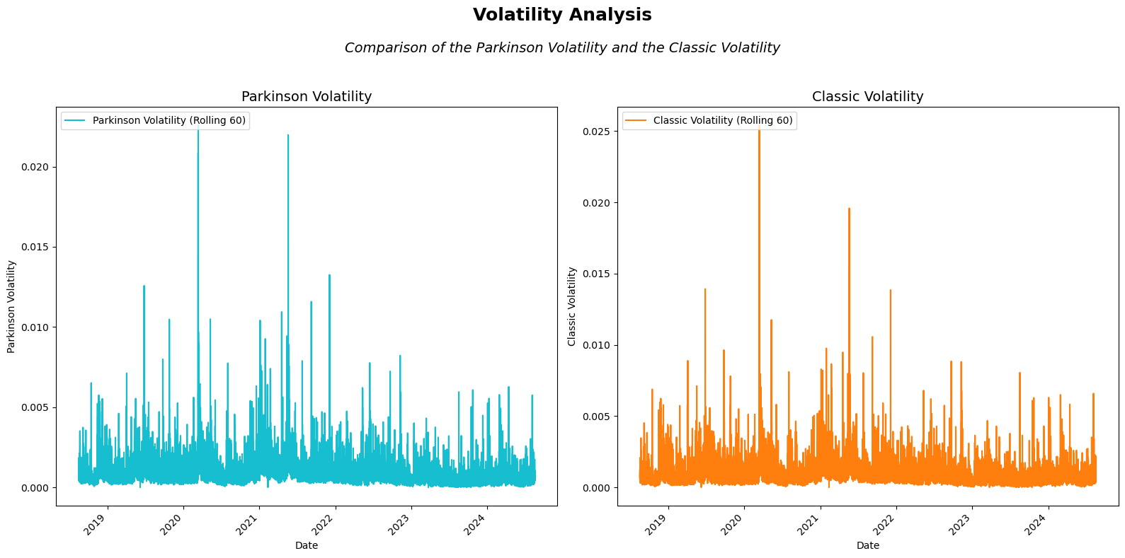
Great! It appears that both estimators show fairly similar behavior, which makes sense given that both are designed to be consistent measures of volatility. However, there are bound to be some differences between them. To better understand these variations, let’s calculate the percentage difference between the two estimators:
# Calculate percentage difference between Parkinson and realized volatility
df['volatility_diff'] = 100 * (df['parkinson_std'] - df['close_close_std']) / df['close_close_std']
Let’s focus on specific time periods to examine the differences between the two estimators more closely, as visualizing all the data at once would likely result in a cluttered and unclear display.
Parkinson Volatility During Bitcoin’s 2020 COVID-19 Crash
- Background: In March 2020, Bitcoin’s price plummeted by over 50% within a week amidst the global financial turmoil caused by the COVID-19 pandemic.
import matplotlib.pyplot as plt

# Define the time range for the 2020 COVID-19 crash
start_date = '2020-02-01'
end_date = '2020-05-01'

# Slice the DataFrame for this time period
df_2020_crash = df.loc[start_date:end_date]

# Create a figure with a 2x2 grid layout
fig, ax = plt.subplots(2, 2, figsize=(16, 12))

# Add main title and subtitle to the entire figure
fig.suptitle('Bitcoin Price and Volatility Analysis during 2020 COVID-19 Crash', fontsize=18, fontweight='bold')
fig.text(0.5, 0.93, 'Comparison of Parkinson Volatility, Classic Volatility, and Price Evolution',
         fontsize=14, ha='center', style='italic')

# Adjust spacing between plots for better layout
plt.subplots_adjust(top=0.85, wspace=0.3, hspace=0.4)

# Plot 1: Bitcoin price (close) evolution during 2020 COVID-19 crash
ax[0, 0].plot(df_2020_crash['Close'], label='BTC Price', color='#1f77b4')  # Deep Blue
ax[0, 0].set_title('Bitcoin Price (2020 COVID-19 Crash)', fontsize=14)
ax[0, 0].set_xlabel('Date')
ax[0, 0].set_ylabel('BTC Price (USD)')
ax[0, 0].legend()

# Plot 2: Parkinson volatility during 2020 COVID-19 crash
ax[0, 1].plot(df_2020_crash['parkinson_std'], label='Parkinson Volatility', color='#17becf')  # Teal
ax[0, 1].set_title('Bitcoin Parkinson Volatility (2020 COVID-19 Crash)', fontsize=14)
ax[0, 1].set_xlabel('Date')
ax[0, 1].set_ylabel('Parkinson Volatility')
ax[0, 1].legend()

# Plot 3: Classic standard deviation during 2020 COVID-19 crash
ax[1, 0].plot(df_2020_crash['classic_std'], label='Classic Std (Rolling 120)', color='#ff7f0e')  # Orange
ax[1, 0].set_title('Bitcoin Classic Volatility (Rolling Std, 2020 COVID-19 Crash)', fontsize=14)
ax[1, 0].set_xlabel('Date')
ax[1, 0].set_ylabel('Classic Volatility')
ax[1, 0].legend()

# Plot 4: Percentage difference between Parkinson and Classic volatility
ax[1, 1].plot(df_2020_crash['volatility_diff'], label='% Difference', color='#2ca02c')  # Green
ax[1, 1].plot(df_2020_crash['volatility_diff'].rolling(60*24*7).mean(), label='7-Day Rolling Avg', linestyle='--', color='#d62728')  # Red
ax[1, 1].set_title('Percentage Difference Between Parkinson and Classic Volatility (2020 COVID-19 Crash)', fontsize=14)
ax[1, 1].set_xlabel('Date')
ax[1, 1].set_ylabel('% Difference')
ax[1, 1].legend()

# Adjust layout to prevent overlap and enhance readability
plt.tight_layout(rect=[0, 0, 1, 0.9])  # Leave space at the top for titles

# Show the plot
plt.show()
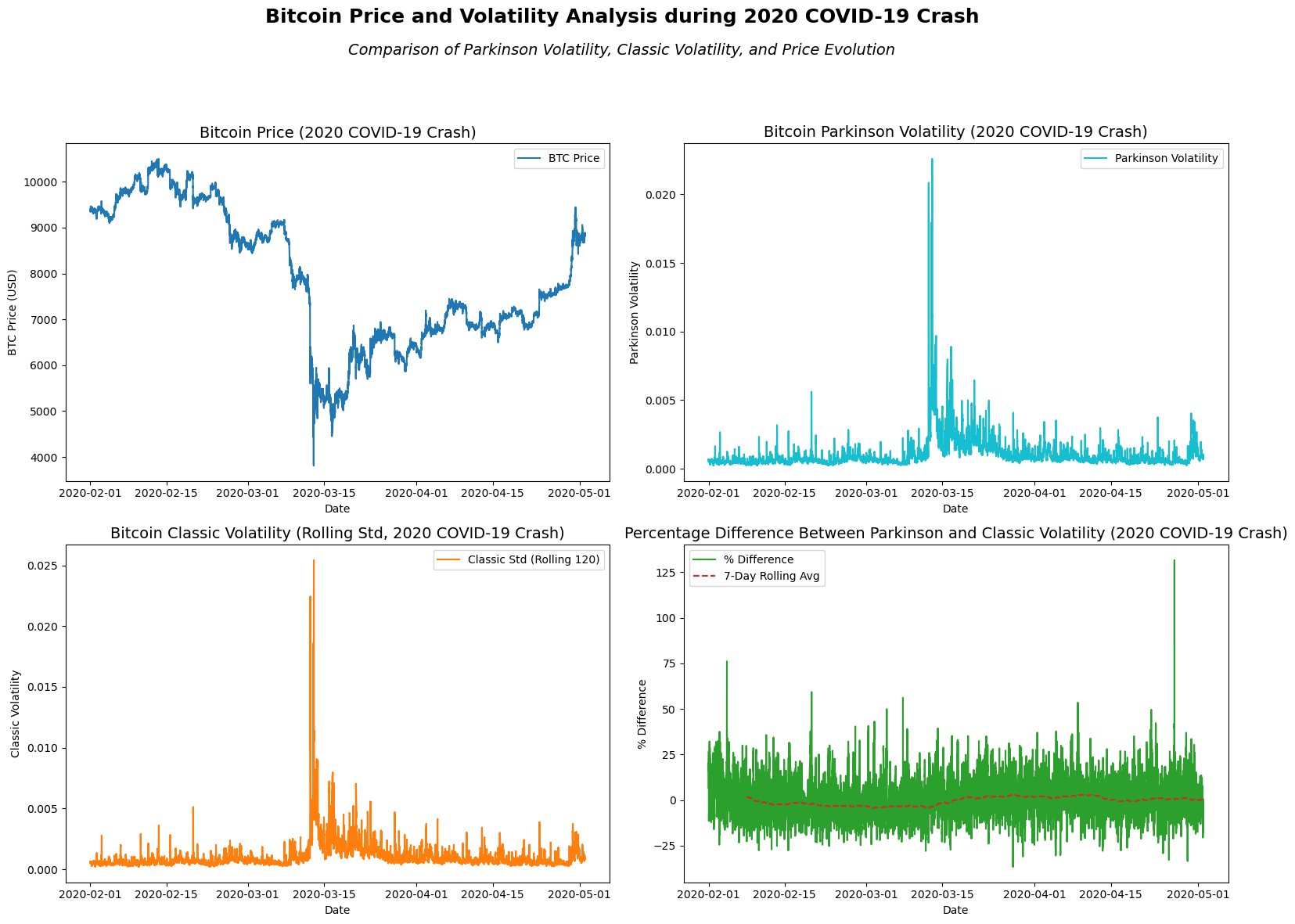
From the visual analysis of Bitcoin’s price and volatility during the 2020 COVID-19 crash, a few key observations emerge:
-
Price Trend: The Bitcoin price experienced significant fluctuations, with a steep decline in early March followed by a rapid recovery in April. This reflects the general market instability during the early phases of the pandemic.
-
Parkinson Volatility: The Parkinson volatility spikes in March, correlating with the sharp price drop, indicating heightened intraday volatility during that period. This volatility seems to stabilize but remains elevated as the price recovers.
-
Classic Volatility: The classic standard deviation, representing the close-to-close volatility, mirrors the pattern seen in the Parkinson volatility, with spikes during March’s market turbulence. However, it smooths out more in the later periods.
-
Percentage Difference: The percentage difference between Parkinson and classic volatility shows consistent fluctuations. A notable feature is the elevated percentage difference in mid-March, suggesting that the intraday high-low ranges (Parkinson) captured more volatility compared to the closing prices during the market’s most turbulent moments.
Overall, this period reflects heightened volatility due to the COVID-19 market shock, with significant short-term fluctuations and a high divergence between intraday and closing-price volatility.
Parkinson Volatility During Bitcoin’s 2024 ATH
- Background: In 2024, Bitcoin surged to a new all-time high, driven by increasing institutional adoption, macroeconomic instability, and growing recognition of Bitcoin as a hedge against inflation. The price rise was fueled by heightened demand for alternative assets, pushing Bitcoin beyond previous record levels set in 2021.
# Define the time range for the 2024 ATH
start_date = '2024-01-01'
end_date = '2024-04-01'

# Slice the DataFrame for this time period
df_2024_ath = df.loc[start_date:end_date]

# Create a figure with a 2x2 grid layout
fig, ax = plt.subplots(2, 2, figsize=(16, 12))

# Add main title and subtitle to the entire figure
fig.suptitle('Bitcoin Price and Volatility Analysis during 2024 ATH', fontsize=18, fontweight='bold')
fig.text(0.5, 0.93, 'Comparison of Parkinson Volatility, Classic Volatility, and Price Evolution',
         fontsize=14, ha='center', style='italic')

# Adjust spacing between plots for better layout
plt.subplots_adjust(top=0.85, wspace=0.3, hspace=0.4)

# Plot 1: Bitcoin price (close) evolution during 2024 ATH
ax[0, 0].plot(df_2024_ath['Close'], label='BTC Price', color='#1f77b4')  # Deep Blue
ax[0, 0].set_title('Bitcoin Price (2024 ATH)', fontsize=14)
ax[0, 0].set_xlabel('Date')
ax[0, 0].set_ylabel('BTC Price (USD)')
ax[0, 0].legend()

# Plot 2: Parkinson volatility during 2024 ATH
ax[0, 1].plot(df_2024_ath['parkinson_std'], label='Parkinson Volatility', color='#17becf')  # Teal
ax[0, 1].set_title('Bitcoin Parkinson Volatility (2024 ATH)', fontsize=14)
ax[0, 1].set_xlabel('Date')
ax[0, 1].set_ylabel('Parkinson Volatility')
ax[0, 1].legend()

# Plot 3: Classic standard deviation during 2024 ATH
ax[1, 0].plot(df_2024_ath['classic_std'], label='Classic Std (Rolling 120)', color='#ff7f0e')  # Orange
ax[1, 0].set_title('Bitcoin Classic Volatility (Rolling Std, 2024 ATH)', fontsize=14)
ax[1, 0].set_xlabel('Date')
ax[1, 0].set_ylabel('Classic Volatility')
ax[1, 0].legend()

# Plot 4: Percentage difference between Parkinson and Classic volatility
ax[1, 1].plot(df_2024_ath['volatility_diff'], label='% Difference', color='#2ca02c')  # Green
ax[1, 1].plot(df_2024_ath['volatility_diff'].rolling(60*24*7).mean(), label='7-Day Rolling Avg', linestyle='--', color='#d62728')  # Red
ax[1, 1].set_title('Percentage Difference Between Parkinson and Classic Volatility (2024 ATH)', fontsize=14)
ax[1, 1].set_xlabel('Date')
ax[1, 1].set_ylabel('% Difference')
ax[1, 1].legend()

# Adjust layout to prevent overlap and enhance readability
plt.tight_layout(rect=[0, 0, 1, 0.9])  # Leave space at the top for titles

# Show the plot
plt.show()
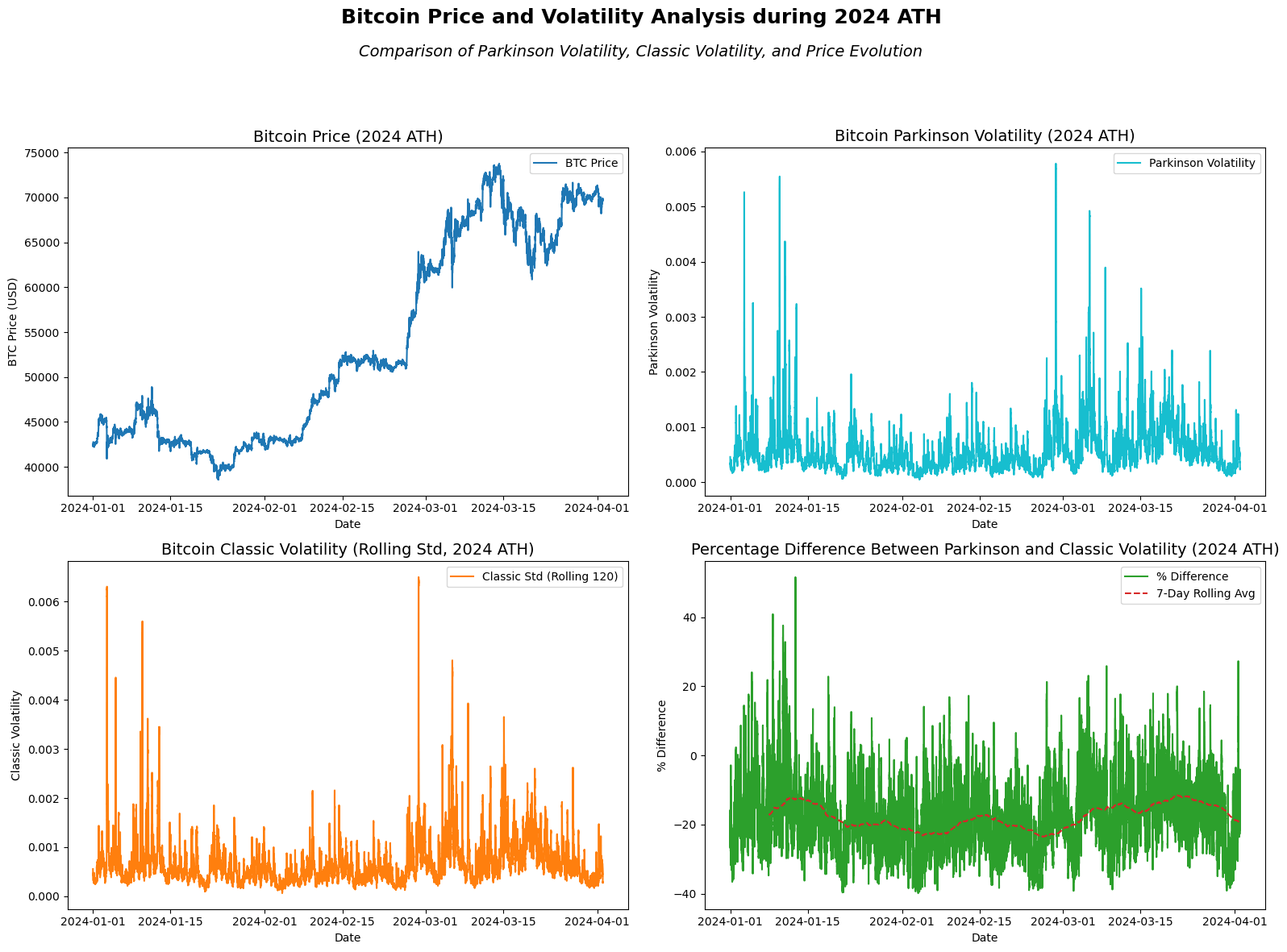
In the analysis of Bitcoin’s price and volatility during its 2024 All-Time High (ATH), several insights can be observed:
-
Price Trend: Bitcoin’s price experienced a significant upward trend leading to its new all-time high, surpassing $70,000 in March 2024. This rally was marked by steady growth throughout January and February, followed by higher volatility as the price approached its peak. The price stabilized but remained elevated after the peak.
-
Parkinson Volatility: The Parkinson volatility, which measures intraday high-low fluctuations, spiked during moments of rapid price movement, particularly as Bitcoin approached its ATH in mid-March 2024. This indicates increased intraday volatility during periods of strong upward price momentum.
-
Classic Volatility: The classic volatility (rolling standard deviation of closing prices) follows a similar pattern to Parkinson volatility but appears smoother. It shows volatility peaks aligned with the rapid price increases but captures less extreme intraday swings.
-
Percentage Difference: The percentage difference between Parkinson and classic volatility fluctuates throughout the period, with notable spikes in volatility divergence as Bitcoin approaches its ATH. The rolling average of the percentage difference shows that intraday volatility (Parkinson) tended to outpace close-to-close volatility (classic) during periods of intense price movement, with the difference narrowing slightly after the ATH.
Overall, this analysis highlights the heightened volatility in both intraday and closing price movements as Bitcoin surged to its 2024 ATH, with Parkinson volatility capturing sharper intraday price changes compared to the classic volatility measure.
Practical Considerations when working on Volatility
A critical decision when implementing a volatility model is selecting the appropriate rolling window length for historical volatility estimation. As Collin Bennett discusses in Trading Volatility, this choice is far from trivial and carries important implications for the accuracy of the model. Specifically, the number of data points used in the rolling window directly impacts the variance of the estimator: a longer window reduces variance but assumes that the underlying market conditions, particularly volatility, remain constant over a longer period.
This assumption can be problematic in practice. In our case, for example, using a rolling window that spans several days or weeks assumes that volatility is relatively stable over that period. However, in fast-moving or highly volatile markets, such an assumption may be hazardous. Short-term market shocks or trends may significantly affect volatility, making a longer window less responsive to sudden changes.
Collin Bennett emphasizes this challenge when he states:
“Choosing the historical volatility number of days is not a trivial choice… while an identical duration historical volatility is useful to arrive at a realistic minimum and maximum value over a long period of time, it is not always the best period of time to determine the fair level of long-dated implieds… volatility mean reverts over a period of c8 months” (Trading Volatility, Bennett).
In essence, while using longer windows may reduce estimator variance, it risks incorporating outdated volatility caused by past events, diminishing the relevance of the estimate for current market conditions. As Bennett suggests, aligning the historical window with implied volatility durations (e.g., 21 trading days for one-month implied volatility) can be a practical approach but should be adjusted to account for events that may no longer impact market conditions.
Conclusion
In this post, we explored the Parkinson estimator as an alternative method for estimating Bitcoin’s volatility, leveraging high and low data points to capture more precise intraday fluctuations. We compared it with the classic close-to-close estimator and observed how the Parkinson estimator provides a better representation of volatility during sharp market movements, such as Bitcoin’s 2020 COVID-19 crash and its 2024 all-time high. While both methods have their merits, the choice of estimator ultimately depends on the nature of the data and the specific trading strategy.
Stay tuned for the next post, where we continue our journey into volatility modeling, exploring more advanced estimators and their practical applications in trading!
I’d love to hear your thoughts! Share your feedback, questions, or suggestions for future topics in the comments below.
References and Further Reading
- Parkinson, M. (1980), Estimating the Variance of the Rate of Return for a Security
- Feller, W. (1951), The Asymptotic Distribution of the Range of Sums of Independent Random Variables
- Great article
- Binance API Documentation: Binance API
Feel free to explore these resources to deepen your understanding.